I was recently tasked with creating a monthly forecast for the next year for the sales of a product. In my research to learn about time series analysis and forecasting, I came across three sites that helped me to understand time series modeling, as well as how to create a model.
- Statistical forecasting: notes on regression and time series analysis: This site provides a deep dive into time series analysis, explaining every aspect in detail. It really helped to me understand what I was doing, but lacked coded examples.
- A Complete Tutorial on Time Series Modeling in R: This is a great tutorial where I was able to better understand stuff from the first site by having a real world example. There are R code examples to follow, but that was only so helpful for me because I work in Python.
- Complete guide to create a Time Series Forecast (with Codes in Python): This is not as thorough as the first two examples, but it has Python code examples which really helped me.
From my research, I realized I needed to create a seasonal ARIMA model to forecast the sales. I was able to piece together how to do this from the sites above, but none of them gave a full example of how to run a Seasonal ARIMA model in Python. So this is a quick tutorial showing that process.
Before we get started, you will need to do is install the development version (0.7.0) of statsmodels. The current version of this module does not have a function for a Seasonal ARIMA model. If you are really against having the development version as your main version of statsmodel, you could set up a virtual environment on your machine where you only use the development version.
The Data:
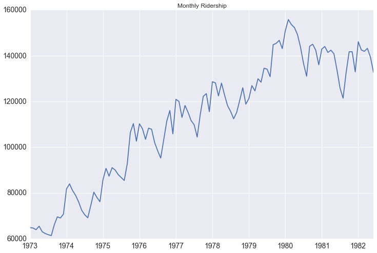
Since I can’t make my company’s data public, I will use a public data set for this tutorial that you can also access here. It is a monthly count of riders for the Portland public transportation system. The website states that it is from January 1973 through June 1982, but when you download the data starts in 1960. I believe there is a mistake in the data, but either way it doesn’t really affect the analysis. I mad a few transformations to the data that you can see in my complete ipython notebook
The process:
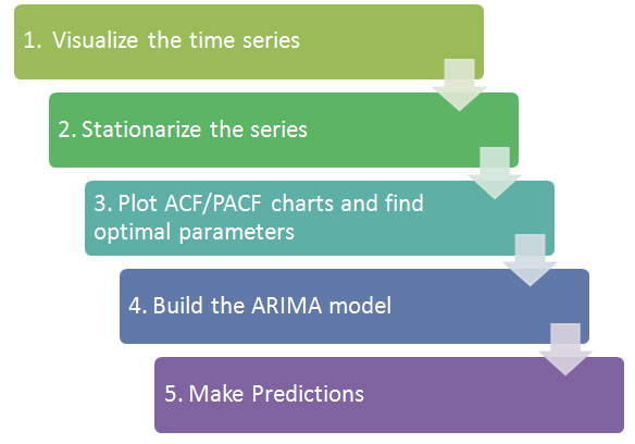
1. Visualize the data:
We first want to visualize the data to understand what type of model we should use. Is there an overall trend in your data that you should be aware of? Does the data show any seasonal trends? This is important when deciding which type of model to use. If there isn’t a seasonal trend in your data, then you can just use a regular ARIMA model instead. If you are using daily data for your time series and there is too much variation in the data to determine the trends, you might want to look at resampling your data by month, or looking at the rolling mean.
As we visualize the Portland public transit data we can see there is both an upward trend in the data and there is seasonality to it.
Another tool to visualize the data is the seasonal_decompose function in statsmodel. With this, the trend and seasonality become even more obvious.
decomposition = seasonal_decompose(df.riders, freq=12)
fig = plt.figure()
fig = decomposition.plot()
fig.set_size_inches(15, 8)
You can actually access each component of the decomposition as such:
trend = decomposition.trend
seasonal = decomposition.seasonal
residual = decomposition.residual
The residual values essentially take out the trend and seasonality of the data, making the values independent of time. You could try to model the residuals using exogenous variables, but it could be tricky to then try and convert the predicted residual values back into meaningful numbers.
2. Stationarize the data:
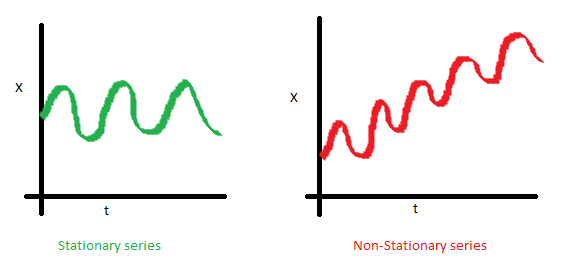
What does it mean for data to be stationary?
-
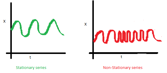
The mean of the series should not be a function of time. The red graph below is not stationary because the mean increases over time.
-
The variance of the series should not be a function of time. This property is known as homoscedasticity. Notice in the red graph the varying spread of data over time.
-
Finally, the covariance of the i th term and the (i + m) th term should not be a function of time. In the following graph, you will notice the spread becomes closer as the time increases. Hence, the covariance is not constant with time for the ‘red series’.
Why is this important? When running a linear regression the assumption is that all of the observations are all independent of each other. In a time series, however, we know that observations are time dependent. It turns out that a lot of nice results that hold for independent random variables (law of large numbers and central limit theorem to name a couple) hold for stationary random variables. So by making the data stationary, we can actually apply regression techniques to this time dependent variable.
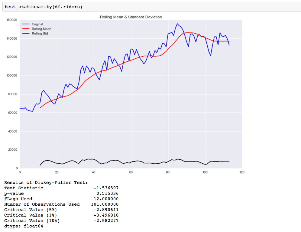
There are two ways you can check the stationarity of a time series. The first is by looking at the data. By visualizing the data it should be easy to identify a changing mean or variation in the data. For a more accurate assessment there is the Dickey-Fuller test. I won’t go into the specifics of this test, but if the ‘Test Statistic’ is greater than the ‘Critical Value’ than the time series is stationary. Below is code that will help you visualize the time series and test for stationarity.
from statsmodels.tsa.stattools import adfuller
def test_stationarity(timeseries):

    #Determing rolling statistics
    rolmean = pd.rolling_mean(timeseries, window=12)
    rolstd = pd.rolling_std(timeseries, window=12)

    #Plot rolling statistics:
    fig = plt.figure(figsize=(12, 8))
    orig = plt.plot(timeseries, color='blue',label='Original')
    mean = plt.plot(rolmean, color='red', label='Rolling Mean')
    std = plt.plot(rolstd, color='black', label = 'Rolling Std')
    plt.legend(loc='best')
    plt.title('Rolling Mean & Standard Deviation')
    plt.show()

    #Perform Dickey-Fuller test:
    print 'Results of Dickey-Fuller Test:'
    dftest = adfuller(timeseries, autolag='AIC')
    dfoutput = pd.Series(dftest[0:4], index=['Test Statistic','p-value','#Lags Used','Number of Observations Used'])
    for key,value in dftest[4].items():
        dfoutput['Critical Value (%s)'%key] = value
    print dfoutput
We can easily see that the time series is not stationary, and our test_stationarity function confirms what we see.
So now we need to transform the data to make it more stationary. There are various transformations you can do to stationarize the data.
- Deflation by CPI
- Logarithmic
- First Difference
- Seasonal Difference
- Seasonal Adjustment
You can read more here about when to use which.
The first thing we want to do is take a first difference of the data. This should help to eliminate the overall trend from the data.
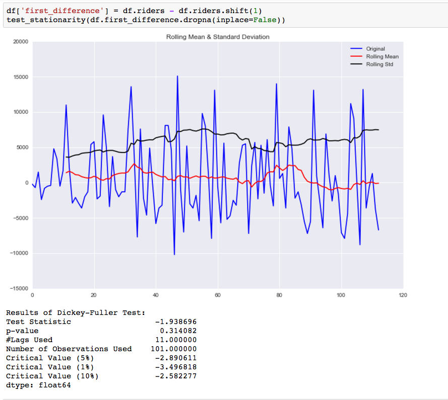
While this helped to improve the stationarity of the data it is not there yet. Our next step is to take a seasonal difference to remove the seasonality of the data and see how that impacts the stationarity of the data.
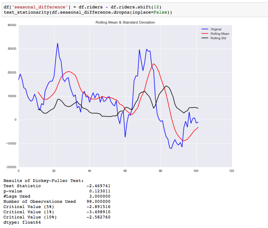
Compared to the original data this is an improvement, but we are not there yet. The next step is to take a first difference of the seasonal difference.
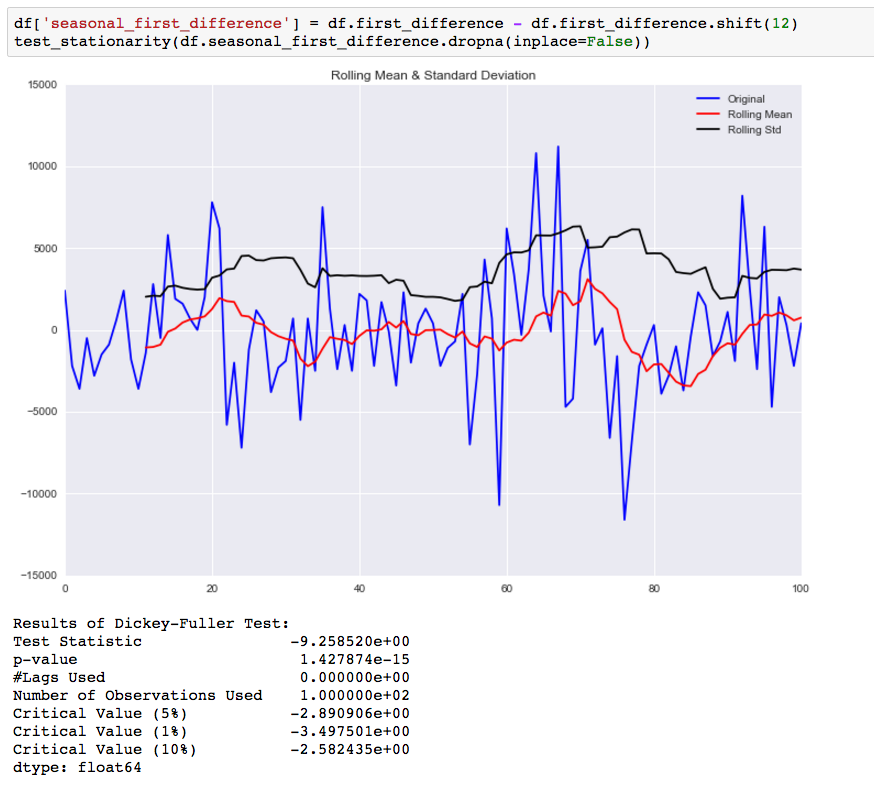
As you can see by the p-value, taking the seasonal first difference has now made our data stationary. I also looked at doing this differencing for the log values, but it didn’t make the data any more stationary.
3. Plot the ACF and PACF charts and find the optimal parameters
The next step is to determine the tuning parameters of the model by looking at the autocorrelation and partial autocorrelation graphs. There are many rules and best practices about how to select the appropriate AR, MA, SAR, and MAR terms for the model. The chart below provides a brief guide on how to read the autocorrelation and partial autocorrelation graphs to select the proper terms. The big issue as with all models is that you don’t want to overfit your model to the data by using too many terms.
Below are the ACF and PACF charts for the seasonal first difference values (hence why I’m taking the data from the 13th instance on).
fig = plt.figure(figsize=(12,8))
ax1 = fig.add_subplot(211)
fig = sm.graphics.tsa.plot_acf(df.seasonal_first_difference.iloc[13:], lags=40, ax=ax1)
ax2 = fig.add_subplot(212)
fig = sm.graphics.tsa.plot_pacf(df.seasonal_first_difference.iloc[13:], lags=40, ax=ax2)
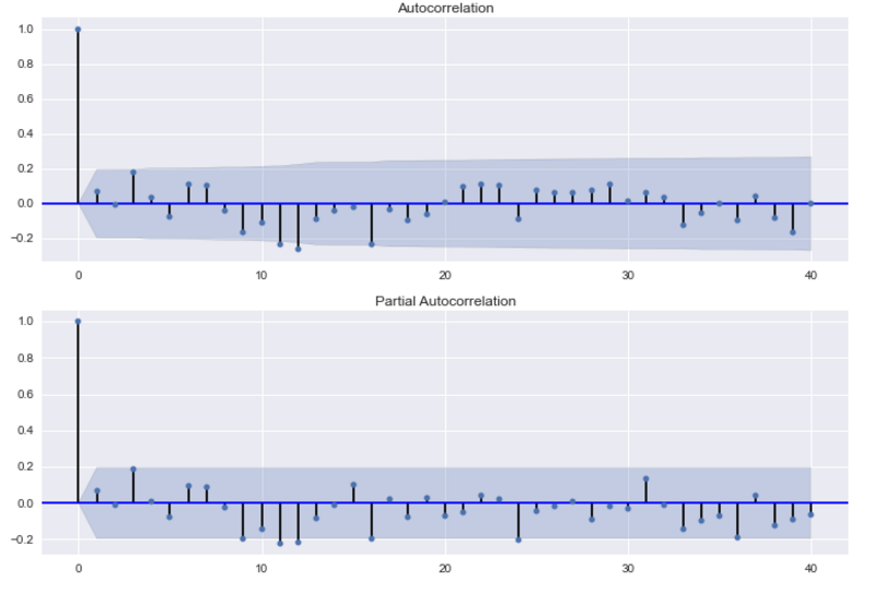
Because the autocorrelation of the differenced series is negative at lag 12 (one year later), I should an SMA term to the model. Trying out different terms, I find that adding a SAR term improves the accuracy of the prediction for 1982. By including this term, I could be overfitting my model. For my job I was fitting models for many different products and reading these charts slowed down the process. So I created a function that fitted models using all possible combinations of the parameters, used those models to predict the outcome for multiple time periods, and then selected the model with the smallest sum of squared errors.
4. Build Model:
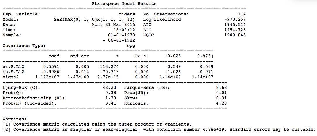
Now that we know we need to make and the parameters for the model ((0,1,0)x(1,1,1,12), actually building it is quite easy.
mod = sm.tsa.statespace.SARIMAX(df.riders, trend='n', order=(0,1,0), seasonal_order=(1,1,1,12))
results = mod.fit()
print results.summary()
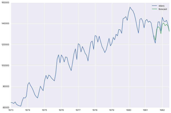
5. Make Predictions:
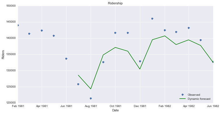
Now that we have a model built, we want to use it to make forecasts. First I am using the model to forecast for time periods that we already have data for, so we can understand how accurate are the forecasts.
df['forecast'] = results.predict(start = 102, end= 114, dynamic= True)
df[['riders', 'forecast']].plot(figsize=(12, 8))
Below is code that creates a visualization that makes it easier to compare the forecast to the actual results.
npredict =df.riders['1982'].shape[0]
fig, ax = plt.subplots(figsize=(12,6))
npre = 12
ax.set(title='Ridership', xlabel='Date', ylabel='Riders')
ax.plot(df.index[-npredict-npre+1:], df.ix[-npredict-npre+1:, 'riders'], 'o', label='Observed')
ax.plot(df.index[-npredict-npre+1:], df.ix[-npredict-npre+1:, 'forecast'], 'g', label='Dynamic forecast')
legend = ax.legend(loc='lower right')
legend.get_frame().set_facecolor('w')
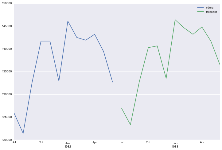
In order to generate future forecasts, I first add the new time periods to the dataframe.
start = datetime.datetime.strptime("1982-07-01", "%Y-%m-%d")
date_list = [start + relativedelta(months=x) for x in range(0,12)]
future = pd.DataFrame(index=date_list, columns= df.columns)
df = pd.concat([df, future])
Now I will have use the predict function to create forecast values for these newlwy added time periods and plot them.
df['forecast'] = results.predict(start = 114, end = 125, dynamic= True)
df[['riders', 'forecast']].ix[-24:].plot(figsize=(12, 8))
End Notes:
Again this is just a quick run through of this process in Python. If you are unsure of any of the math behind this, I would refer you back to the first link I provided. Also, this model in statsmodel does allow for you to add in exogenous variables to the regression, which I will explore more in a future post.